Improving Product UX
Toptal is a freelance platform that caters to expert talent and corporate clients. We conduct a rigorous vetting process for freelancers, accepting a small percentage of applicants into our talent network.
Our clients can use a dedicated "Client Portal" to post jobs, receive and view a list of talent to choose from, schedule an interview with these talents, or hire one on the spot.
I was tasked with improving the UX on dozens of legacy screens in the Client Portal, this was one of them.
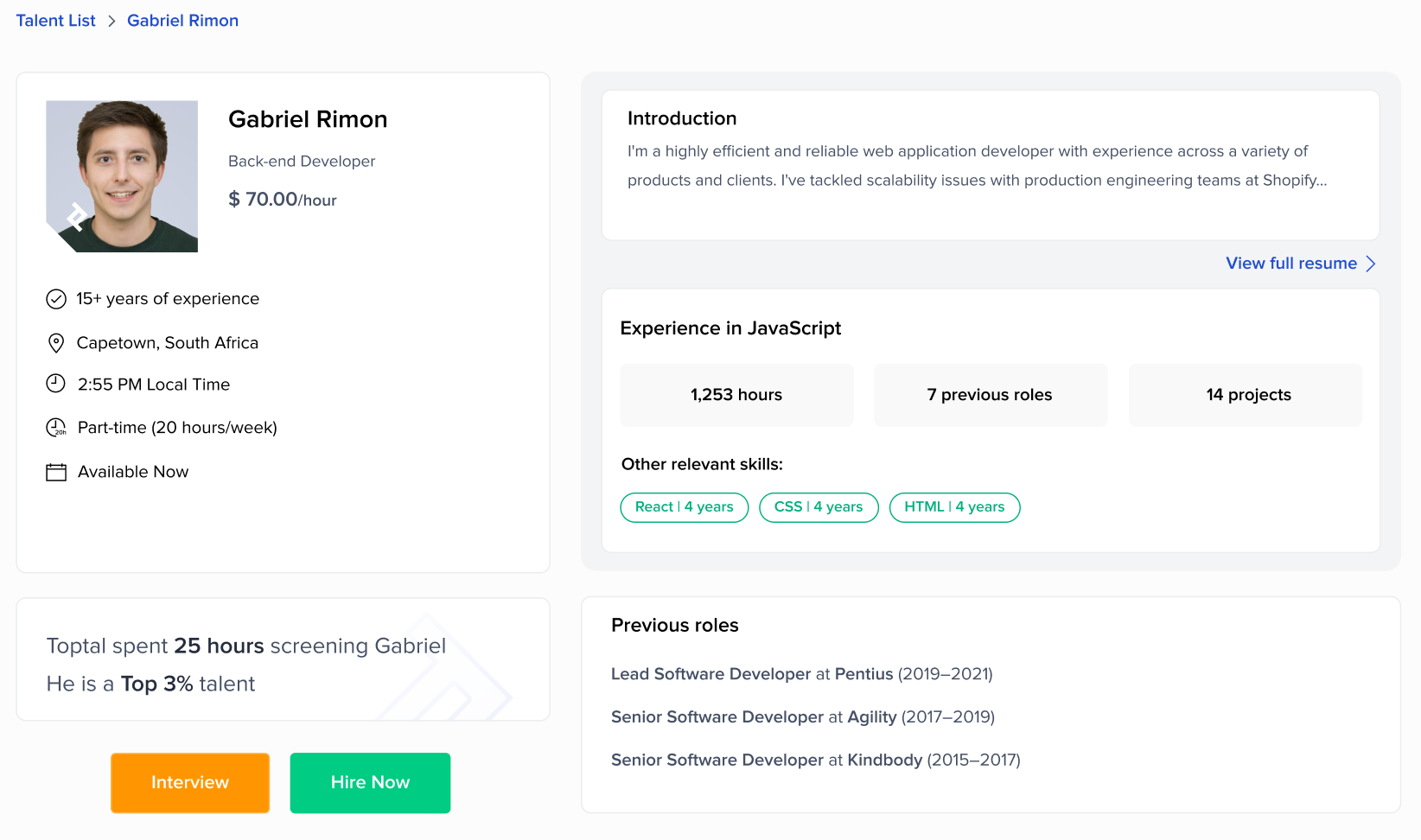
On this screen, clients were expected to gain information on the talent, then choose next steps in the hiring process.
Please take a look at this screen for a few moments:

First, I considered the goal of this screen from Toptal's perspective:
Convince the client to hire this talent.
Then, I considered the use cases from a client's perspective:
"Should I hire this talent?"
"I want to hire this talent. How do I do it?"
I highlighted every element which detracted from these goals.

I grouped these problems:
- Unhelpful, repetitive information.
- The talent's name was repeated five times, three of these were cluttered near the same position (top-left quadrant). Knowing the talent's name at this stage did not improve hiring chances.
- The word "experience" was repeated in various forms, but they did not contribute to the impression of an "experienced freelancer."
- "Level: Expert" meant very little to clients, even with context; after all, Toptal was supposed to only accept experts into the network.
- Talent statistics (1,253 hours, 7 previous roles, 14 projects) used repetitive qualifiers ("with JavaScript as the main skill").
- Indirect/inaccurate wording.
- "Other skills and industries that match your job" could be shortened.
- "Relevant employment" could be worded better -- this term was drawing a distinction between freelancing and a full-time job, which contradicted brand guidelines.
- "Availability: Part-time" and "Can start: Immediately" can be shortened (and made more scannable).
- Several CTAs led away from this screen, and did not improve the talent's chances of being hired.
- "Find out why >" opened a Toptal informational landing page in a new tab, featuring an explanation of the "Top 3%" model. This increased the risk of clients not tabbing back, and thus not hiring.
- There were two buttons which led to the same full resume.
- "Show more" was unnecessary, as the role descriptions were featured in the full resume.
- The Hiring CTAs were not prominent.
- It was our preference that clients chose to hire freelancers right away, rather than interviewing them further. "Schedule Interview" was in green, while "Hire Now" was in white (visually less encouraging).
- The buttons were too small, and out of the way.
Here were my improvements:

I coordinated with my PM to ensure Engineering's capacity for implementing these changes, then proposed this to stakeholders. The improvements were approved for A/B testing.
After deployment, both hire and interview rates improved drastically.